What becomes a flag most? It needs to be easily distinguishable at a distance, often while moving and from either front or back. It waves its erudition lightly, showing the heritage and allegiances of the entity it represents. Excerpted from Good Flag, Bad Flag, here are some vexillological verities:
KEEP IT SIMPLE. “The flag should be so simple that a child can draw it from memory. . . . Most poor designs have the elements of a great flag in them—simplify them by focusing on a single symbol, a few colors, large shapes, and no lettering. Avoid the temptation to include a symbol for everybody.”
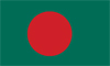 |
BANGLADESH The rising sun of independence in two bold colors. |  |
TURKMENISTAN A complicated rug with five patterns, when the moon and stars would be enough. |
|
USE MEANINGFUL SYMBOLISM. “The flag’s images, colors, or patterns should relate to what it symbolizes . . . Usually a single primary symbol is best—avoid those that are less likely to be representative or unique. Colors often carry meanings: red for blood or sacrifice, white for purity, blue for water or sky.” | |||
 |
IROQUOIS CONFEDERACY The Hiawatha’s Belt symbol has represented the five tribes’ unity since before 1600. |  |
NAVAJO NATION More than 20 graphic elements, and none is large enough to be seen easily. |
|
NO LETTERS OR SEALS. “Lettering is nearly impossible to read from a distance, hard to sew, and difficult to reduce to lapel-pin size. . . . Seals were designed for placement on paper to be read at close range. Very few are effective on flags—too detailed. Better to use some element from a seal as a symbol.” | |||
 |
CÔTES-D’ARMOR The stylized seagull is also the shape of this French département’s coastline. |  |
LOIR-ET-CHER Too many words, and a gray shape clutter up the stylized salamander. |